Designing a Legacy piece for UTS’s Bachelor of Creative Intelligence and Innovation degree in the form of merchandise.

THE PROCESS
In order to create merchandise using the official degree name, I had to get approval from a range of people across UTS. The first thing I had to do was define the purpose of creating such a product. Visual identity is one of the key attributes of giving meaning to a name, brand or organisation. The thought process behind designing an item of merchandise for the students of the Bachelor of Creative Intelligence and Innovation was to give the degree a visual identity as well to allow the students to celebrate being apart of a community of complex thinkers and change makers within the university. While the degree intakes only a small amount of students across the university in comparison to larger faculties, it felt necessary for the students to celebrate the rarity of the degree as it is the first of its kind in universities throughout Sydney.
WHY MERCHANDISE
Giving the degree this visual asset allows not only students within the university to be proud to identify themselves but give recognition of students from outside of the university such as industry professionals and partners. As the Bachelor of Creative Intelligence and Innovation continues to grow in not only numbers but repertoire, having a designed item allows this recognition and identification and sense of belonging from the students from all stages of university life; first, second, third and fourth years as well as alumni.
GATHERING INTEREST
With over 50 students across year groups interested in the merchandise, its intentions are to be for students, and therefore it made sense to allow the students to share their thoughts and ideas of what they wanted the crest of the item to appear as. It became apparent that they wanted the name of the degree to be spelled out, to emphasise the complexity and intelligence that follows the degree name while simultaneously providing mention that this course is a product of the University of Technology Sydney. However, the design process became challenging as majority of the students fancied the aesthetics that came along with classic university merchandise’s that are often found in elite universities and institutions often associated with America which opposed the visual identity that UTS has recently undergone. While there were thoughts to remove UTS’s name from the design to save having to get approval, it felt like it needed to be there for the students to feel proud of being able to attend the university and undergo such a unique degree.
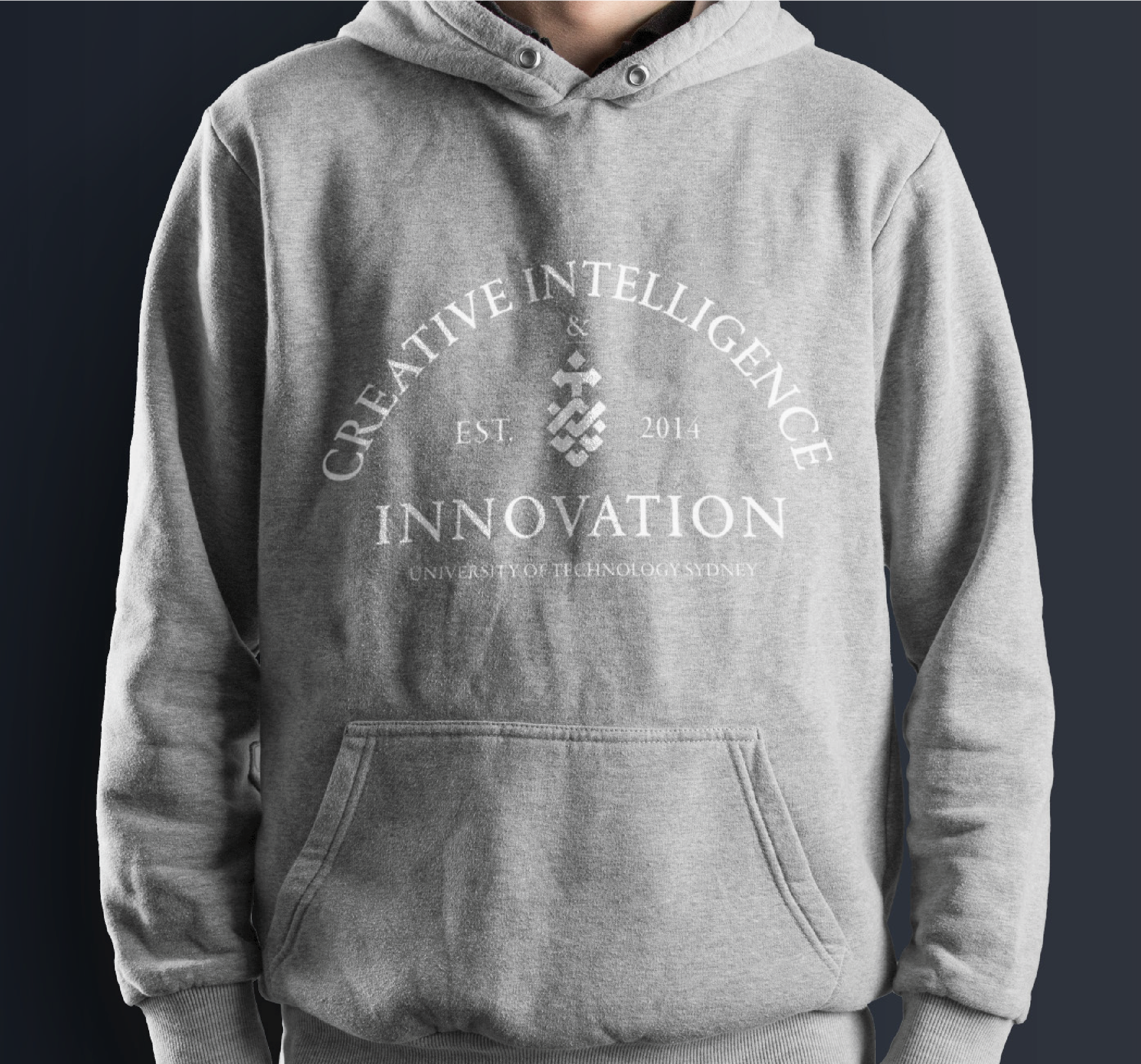
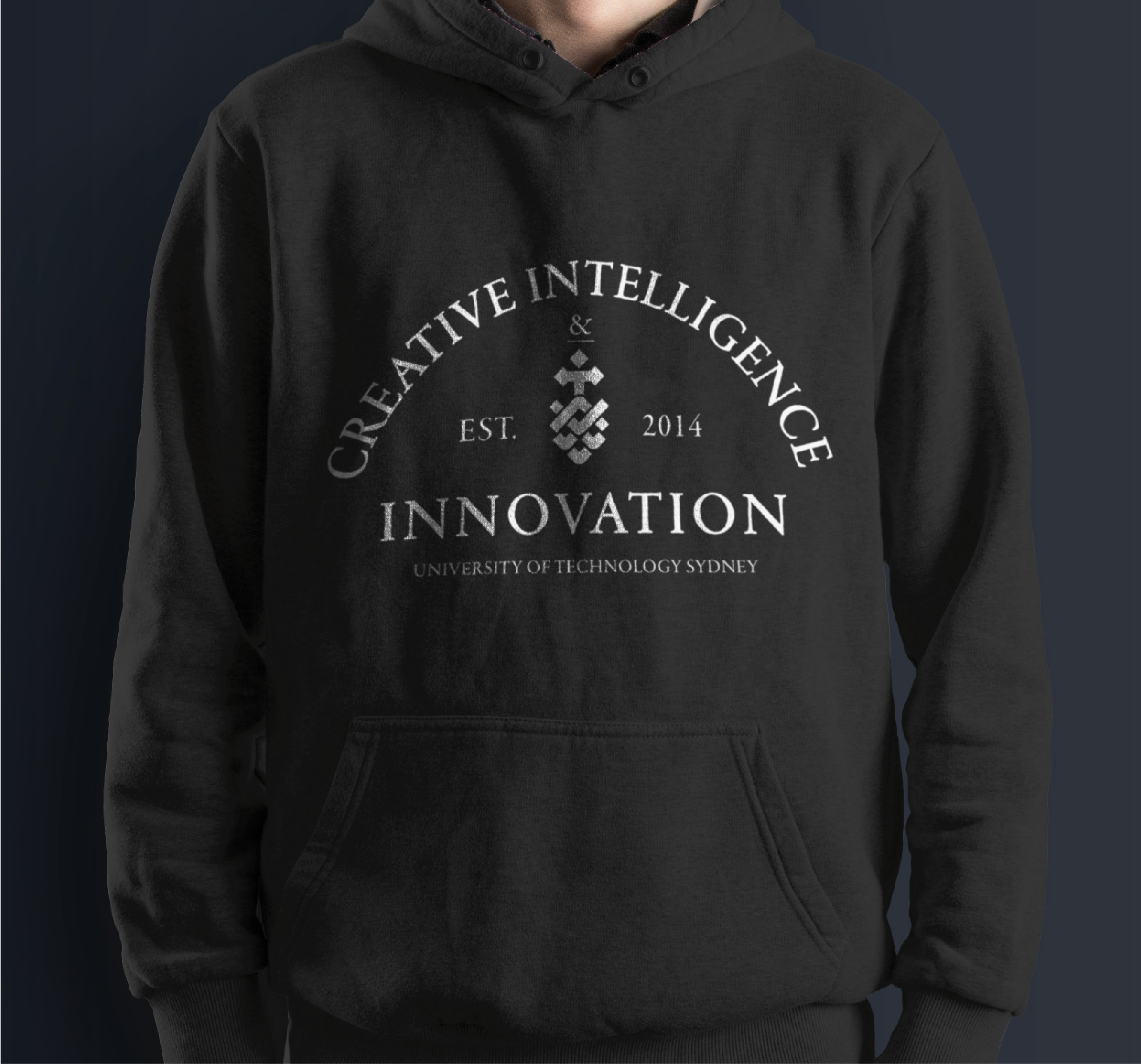
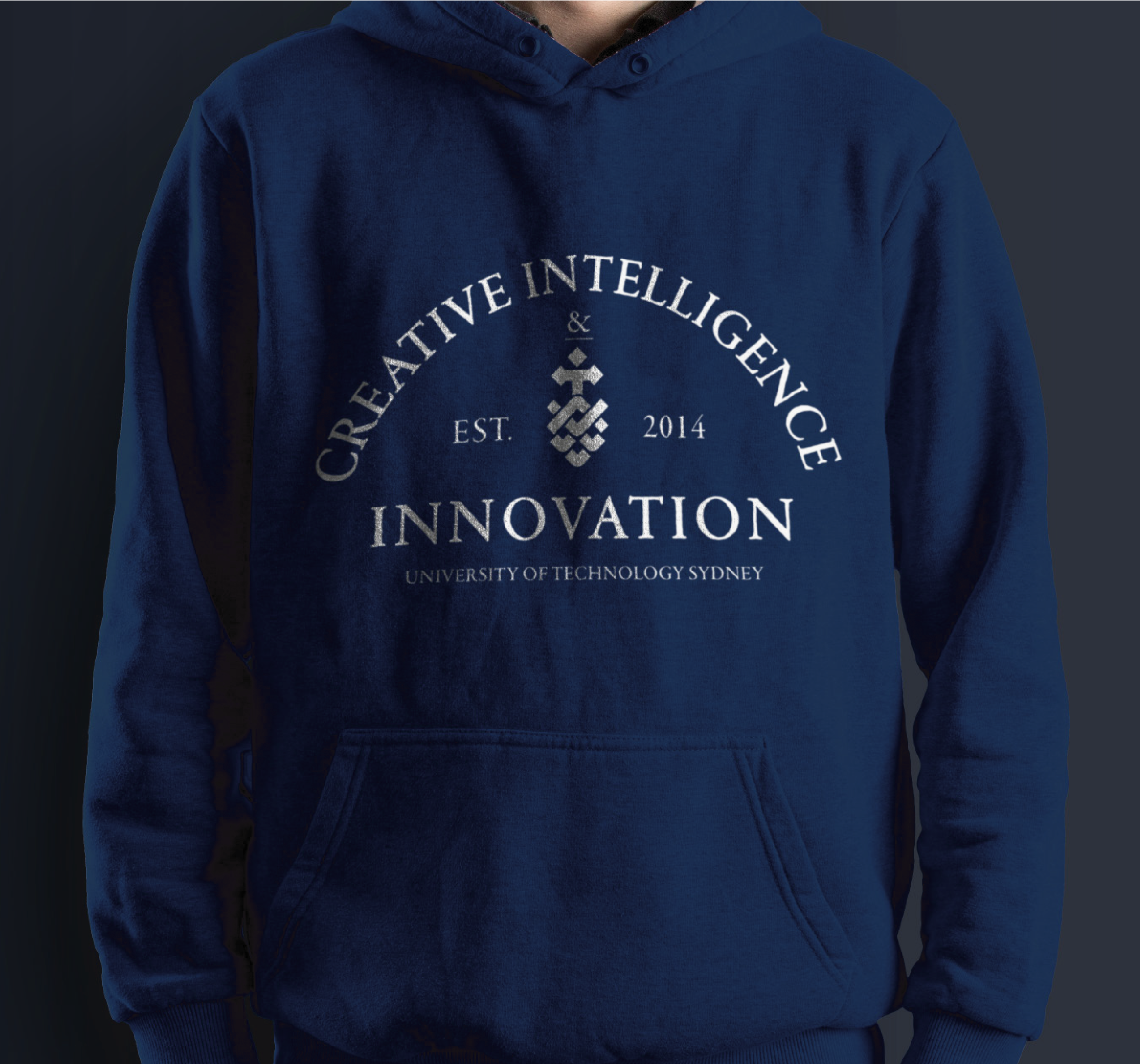
THE FIRST DESIGN


FEEDBACK FROM STUDENTS
“Love the navy choice!!!”
— Bec Hatton
“Back this so hard”
— Jack Jahn
“I like it!”
— Oliver Damian
“Ooft this is swish, love it!”
— Chloe Fisher
“Really loving the idea of BCII-wide merch!”
— Zachary Gee

GIVING CUSTOMERS A VOTE
The design was presented to a facebook group containing members from all cohorts in BCII, from first, second, third, fourth years and alumni. After having narrowed down the design option to one design from conversations from my own cohort, I presented a mockup of the merchandise to the entire student body of BCII to gage if there was interest in purchasing the product. A total of 69 students had expressed an interest which gave feasibility to the project.
Navy jumper + white text — 36 VOTES
Black jumper + white text — 12 VOTES
Grey jumper + white text — 3 VOTES
Grey jumper + black text — 0 VOTES
CHALLENGES AND ROADBLOCKS
UTS wanted to be viewed as a new university with modern features which didn’t correspond in the original design, even though a large number of students had expressed interest in the design. With the Bachelor of Creative Intelligence and Innovation being a product of UTS, the merchandise had to match the guidelines and branding that UTS had recently redeveloped.
REDESIGNING THE MERCHANDISE
In order to design something that both the students, faculty members and UTS were satisfied with, a number of emails and meetings had to take place in order to progress in the design. A meeting was arranged with Louise McWhinnie, the dean of the Faculty of Trans-Disciplinary Innovation, where the emblem shifted from being a classic crescent to a more modern look, considering typography, lettering and the UTS branding. Her feedback was to go in the direction of sans serif, taking into consideration the fonts that UTS currently use to match their visual identity and branding. The design was suggested to take the form of something that appeared a lot more modern and challenged conventional university designs as that is what the Bachelor of Creative Intelligence and Innovation was created for. In order to make sure the design that was created meet the correct standards that UTS would approve, another meeting was kindly set up by Louise to meet with Shahnam Roshan, Creative Lead in Creative Services Team from the Marketing and Communication Unit.


MEETING WITH UTS’ LEAD DESIGNER
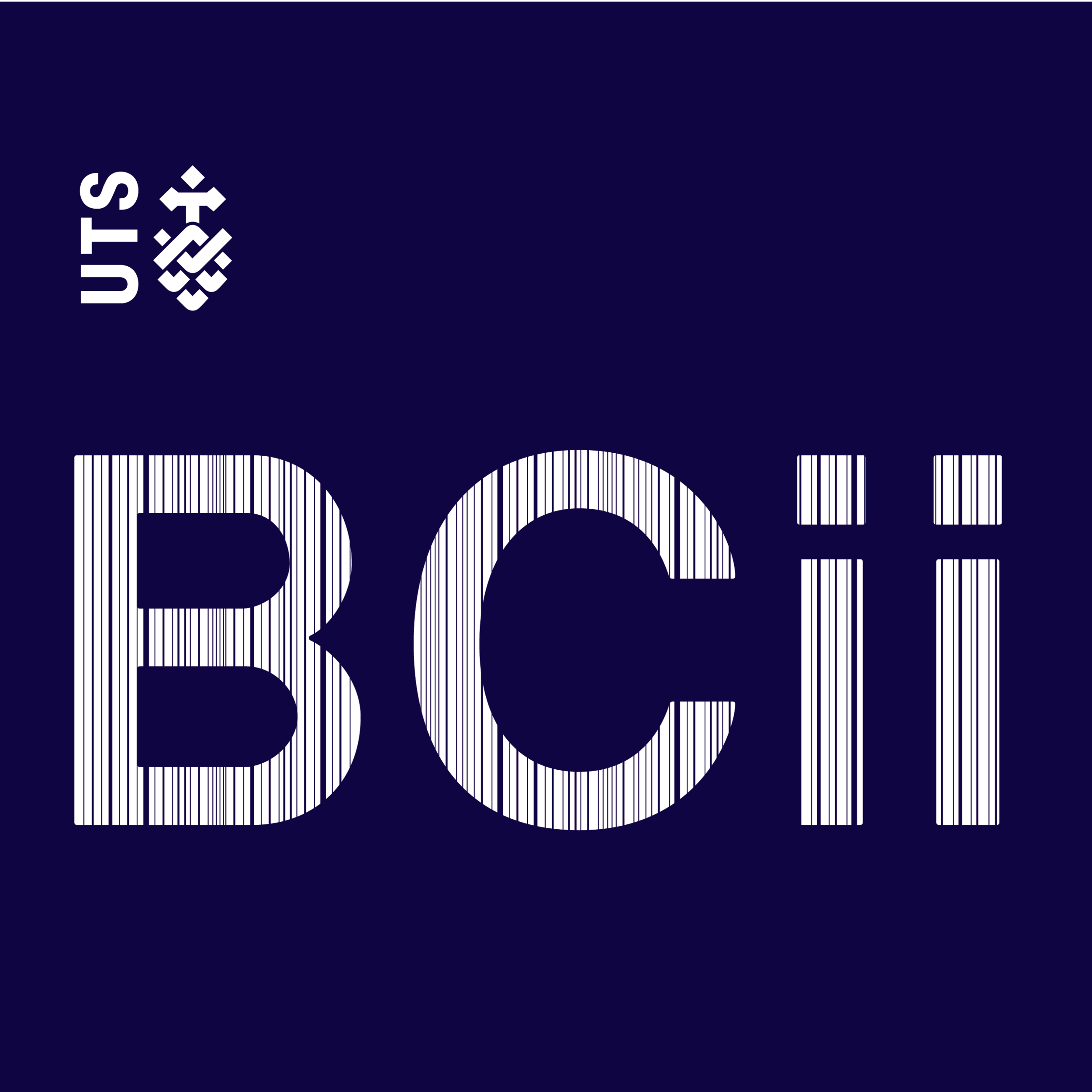
The meeting took place in the Marketing and Communication Unit with Shahnam and assisted by Anna Nordon, a student in third year BCII majoring in Visual Communication and was extremely insightful. Together we co-designed a new modernised crescent that followed closely to the UTS guidelines that both the faculty and university would approve for distribution. Following this meeting gave interesting insights into the correct use of the logo as well as typography, however it was encouraged by both Shahnam and Louise to challenge the guidelines in attempt to think of something outside of the box, to add to the characteristic of the degree. Another thing that was an interesting take away form the meeting was learning that UTS does not allow the abbreviation of titles in any written form. Which challenged the design further as majority of students identify the degree as “BCII” over “Bachelor of Creative Intelligence and Innovation”.

DIGITAL DESIGN ITERATIONS
Creating a range of options was important so expose a variety of ways in which the visualisation could do. Following the guidelines, each iteration was sent through to Anna to receive feedback and further direction as to which design was the strongest and met the needs of the style guide best.


MEETING THE DESIGN REQUIREMENTS
In order to confirm the design, there were constant check-ins with Anna, who works closely with Shahnam, to make sure that the design was heading in the right direction while simultaneously working collaboratively with another BCII student. Many iterations were made using the guidelines and together one was selected favourably to be sent to Shahnam for confirmation of approval. The response on the new design following the guidelines were taken with positive approval, however room for refinement was still needed.


KEEPING THE LEGACY
“This look fab. Lay out is great, look and feel fits the brand and its really cool. My only comment is about the faculty name as if it is clear. Other than that’s all good from my end.”
— Shahnam Rosham
“Hi Leah, now that is FTDi merchandise that I would buy! I like it. One option, can either the word UTS or the UTS logo be used as the tittle on the i of Innovation... otherwise, I like the positioning”
— Lousie McWhinnie
With the design finalised, production and distribution is able to take place. With approval from the university, it now is able to be worn amongst it’s students while also giving the Bachelor of Creative Intelligence and Innovation and new visual identity that celebrates it’s uniqueness.
In order to ensure this design acts as a legacy, a website will be set up for distribution of these jumpers, branded as “unofficial merchandise of the Bachelor of Creative Intelligence and Innovation”. This will allow students to purchase the jumper, with funds going straight to the supplier, delivery and fees to keep the web live, long after 2018. Control of the website can be given to either faculty members of BCII connect, to ensure the name of BCII lives on amongst it’s students while giving everyone involved in the degree a momentum to remember.