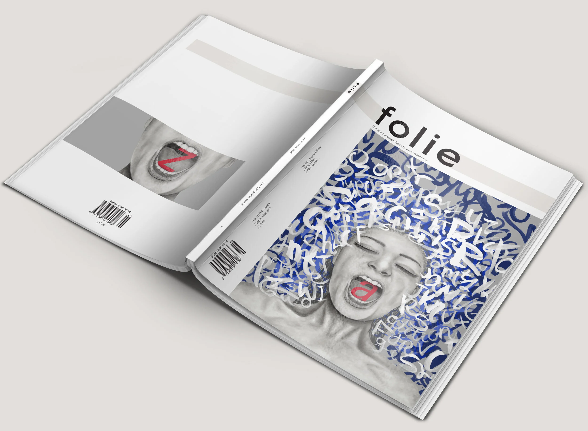
Folie came together as a magazine focusing on the personal nature of design and the minds of designers. This magazine highlights the conceptual practice of design. Inspired by the beauty of the French word madness, Folie celebrates the madness of design straight from the mind.


‘FOLIE’
Folie which when said and read, has a very simple and delicate feel about it, however its meaning juxtaposes this foreign assumption of the word, with its literal meaning being “madness”. With these two polar opposite reactions to the word, it became the perfect representation of what design is and is perceived as.
With design often comes subjectivity and objectivity, and by combining these two elements that are known to be notorious in the design world, the concept of ‘folie’ advocates this exact idea.
As a designer, projects and artworks are made through imperfections, experiences, trends, thoughts and inspiration from the world around them, creating them in one way, and later having their work perceived differently in another way.
It is often that design is confronting and communicates issues from the world around us, and so by using this platform, ‘folie’ will be able to share the madness and chaos created by designers and shared to its audience as design. Using an illustrated self portrait heightens the relationship between the designer and the artwork created and made the work seem very personal.
Using both hand crafted illustrations and digital media, the entirety of the magazine uses combinations of these two mediums to celebrate design in its unique forms. The theme of this particular issue celebrates typography. Articles range from discussing the importance of white space to drawing back onto the history of how typesetting was introduced and how it progressed throughout time.
The front page design draws inspiration from both these two featured articles by using elements of white space as well as different forms of handwritten lettering. The way in which the lettering surrounds the illustrated portrait alludes to the ever present nature of typography.
WHITE SPACE
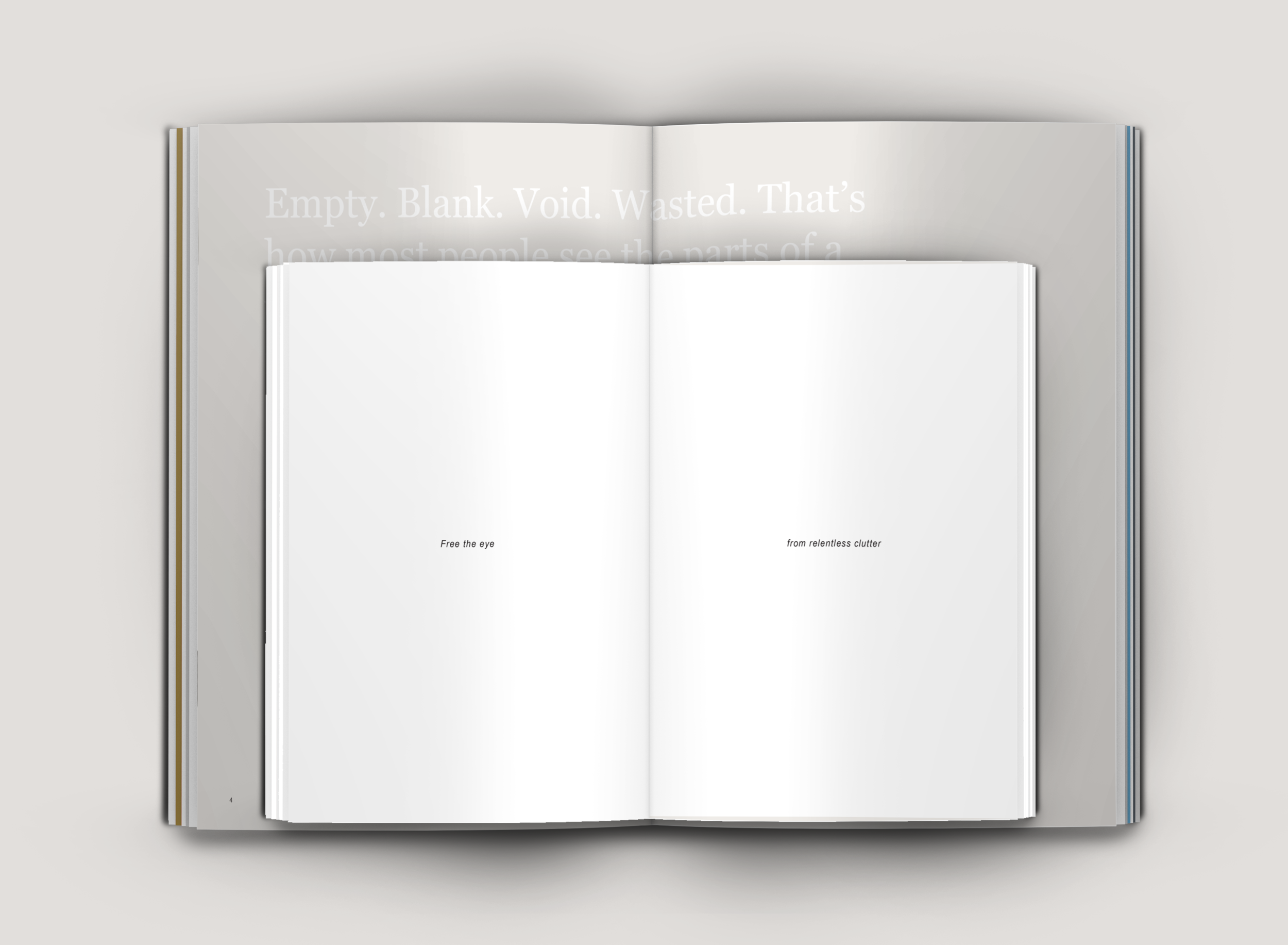
‘White Space’ written by Ellen Lupton is a featured article and talks about the importance of its use. While the introduction to the article appears full and perhaps cluttered, the inserts in the middle offer the eye some ease as it responses to the article with immense use of white space.
TYPEFACE AND TYPOGRAPHY
Kenya Hara’s 'Typeface and Typography' article articlates the transition of type since the introduction of letter pressing in during the imperial Chinese Dynasty. The illustrated hands each hold a different letterform, indicating that both images were made from hand but serve different purposes. The notion of ‘giving’ the type to the portrait draws on the overwhelming statement that type is everywhere and shoved into our faces.
The playful nature of interacting with the type as seen in the pull quote reveals how flexible type is and how much we, as designers are able to maniuplate it in all forms.


