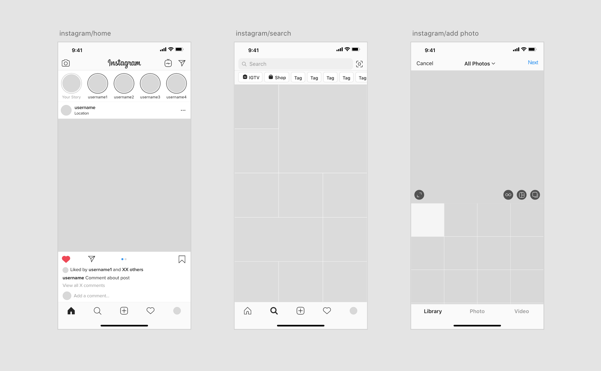
Instagram is one of my favourite User Interfaces because of how clean and intuitive it has always felt to me. I decided that one of the best ways to learn could be to recreate it to learn from it’s features.
Doing this allowed me to design my own customisable mockup, while giving me a deeper understanding about the use of components, design systems and UI elements.
THE PROCESS
Following along with the mobile application, I mapped out all the pages and grouped them depending on where in the architecture flow they sat and identified all the repeating elements to create components before building out each page.
Once all the components were created, I grouped them all to create a design system style guide so that it was easy to identify all the assets.
From this experience I was able to learn about appropriate use of font sizes, the different options available with page navigation and the important of white space around interactive elements such as icons and buttons.