OFXResearch to redesign the digital experience
This research project began as a clear need to create a solution to combine all of OFX’s digital offerings into one platform as having multiple logins to different products was causing frustration amongst customers. The aim was to collect insights to see how we could redesign the platform to meet the needs of our customers while also staying relevant in the current market landscape.

What was the problem space?
Businesses of all sizes have different reasons for needing to make FX payments. Currently OFX has a range of different web products offered to customers with varying needs, making it difficult for customers with access to multiple products to manage their FX payments. We want to make sure that our new Customer User Interface can meet a variety of needs and that we offer tools that our customers need and expect to find in an online FX service.
The research process
In keeping up with the market, the Customer User Interface (CUI) became the solution to combine the Online Sellers product (OLS) and Global Currency Account product (GCA) into one platform, while allowing both single and multi-user capabilities depending on the business needs. The focus for this initial round of testing is to focus on the new look and feel of the prototype, getting feedback on the refreshed transfer experience for spot transfers, multi-user capabilities.
-
Using Askable (a marketing recruitment platform) and contacting exisiting customers, I was able to sort through and gather a range of participants - with varying FX Business needs - to observe how they navigate through the an interactive prototype designed in Figma. The aim was to test with existing and prospective clients on what we believe the new OFX Client User Interface could look like if we combined all our current products into one platform. In the sessions I made sure to validate the discovery work against the following pillars: User interface (refreshed look and feel), access control of account management and improvement to workflows for transfers.
-
Receive thoughts from existing customers on combining OFX’s existing products into one platform under a new design.
Receive feedback on the overall design
Evaluating the effectiveness of the flows
Identify any gaps in the design that may be essential to consider reviewing
Testing if the transfer process is intuitive and meets the criteria required by our customers (and define what that required criteria is)
-
18 participants were selected to interact with the newly designed prototype to provide feedback on the new design and to validate any challenges or concerns we may have had with the design. A range of existing customers from both the corporate and consumer side were included in the pool so that we could get an idea of how the new design compared with their current experience.
Sessions were 60 minutes, beginning with questions to understand their FX needs, followed by three scenarios with tasks for them to complete. These tasks allowed us to understand how the participants use the prototype and provide insights for us to make adjustments when errors appeared or when participants seemed confused.
All sessions were accompanied by at least one other member of the Product team to help scribe, take notes, or observe.
-
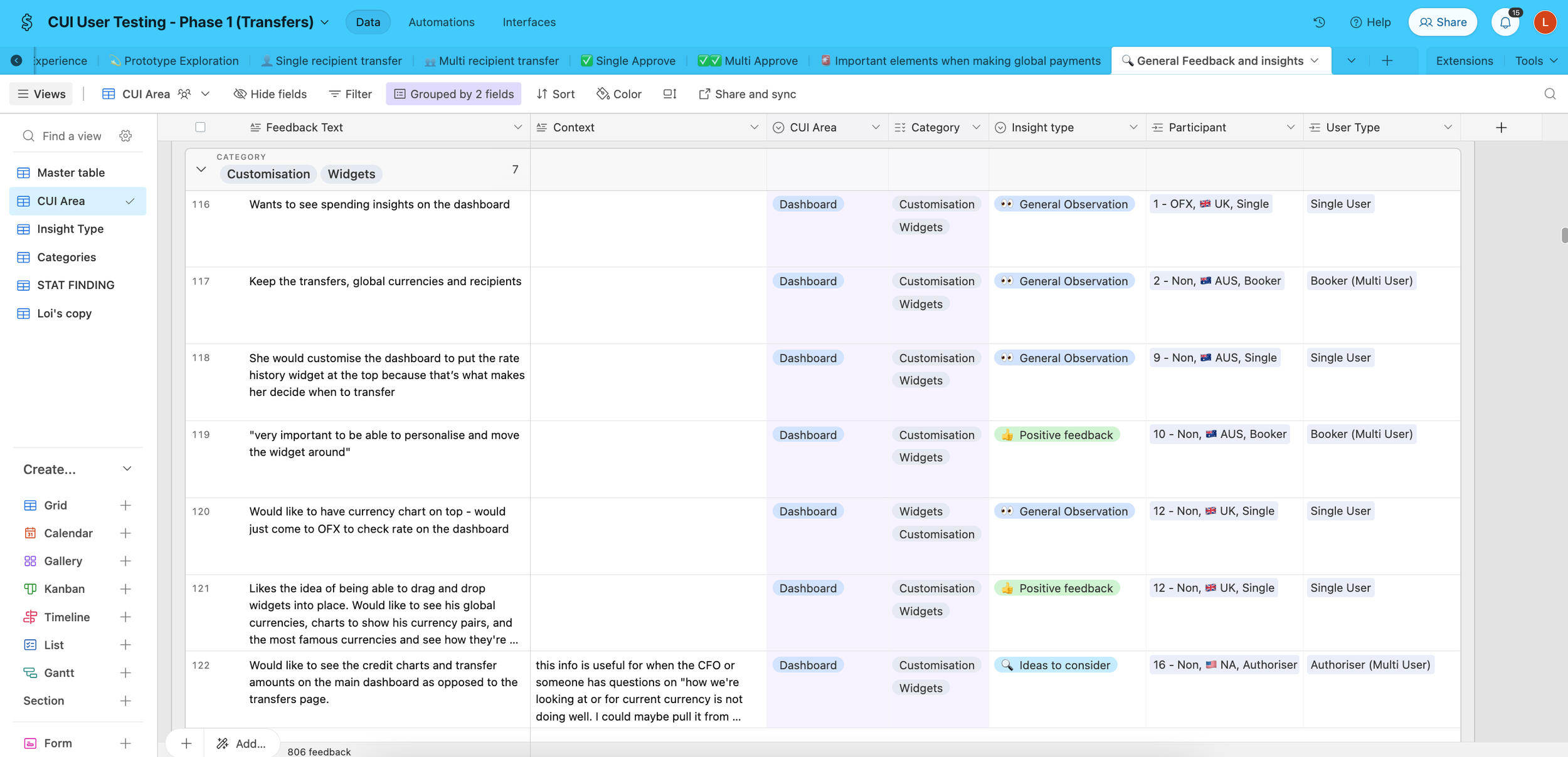
I used AI to capture transcripts of all sessions to be able to quickly search through specific and recurring themes, alongside the notes scribed by my colleagues. All questions and scenarios were broken down into sections and categorised into Airtable as a way to sort through and find patterns in qualitative data. I manually tagged each participant’s responses and reactions into themes and used Airtable’s sorting features to showcase gaps, suggestions, and reactions that recurred throughout each session.
I used this data to identify recurring themes that needed to be addressed, what was currently working with the new prototype and any gaps that were raised by participants to stand out in the market.

Appendix
How did I get here?
I broke down each section of the product into 3 main themes for research and discovery. Login, transfers and account settings. Each topic went through a thorough UX audit so that I could clearly map out user flows and present changes, gaps and areas for improvement to the business.
-
What we want to know:
Multiple accounts
Users who have multiple accounts and use different emails for access need an easier way to switch without having to constantly sign in and out.Business users
Businesses are most likely to log into their account using their desktop browser.Login Credentials
Users want their login credentials remembered on the device they use the most.Session expiration
Users won’t want to keep logging back in every time the session expires in case they are in the middle of something important and needed to find documents.Multi- factor authentication (MFA)
Users don’t want to have to keep verifying MFA if they’ve signed in within a certain amount of time.Link accounts
Users want to link their multiple accounts so that they can easily access all their accounts without the need to log in and out.What we want to achieve:
✅ Strike a balance between security and convenience
✅ Easy access to the secure platform on any device whenever, wherever
✅ Simplify login for users who access a single account
✅ Simplify login for users who access multiple accounts
✅ Give users control on identifying who they are
✅ Instil trust and confidence
-
What we want to know:
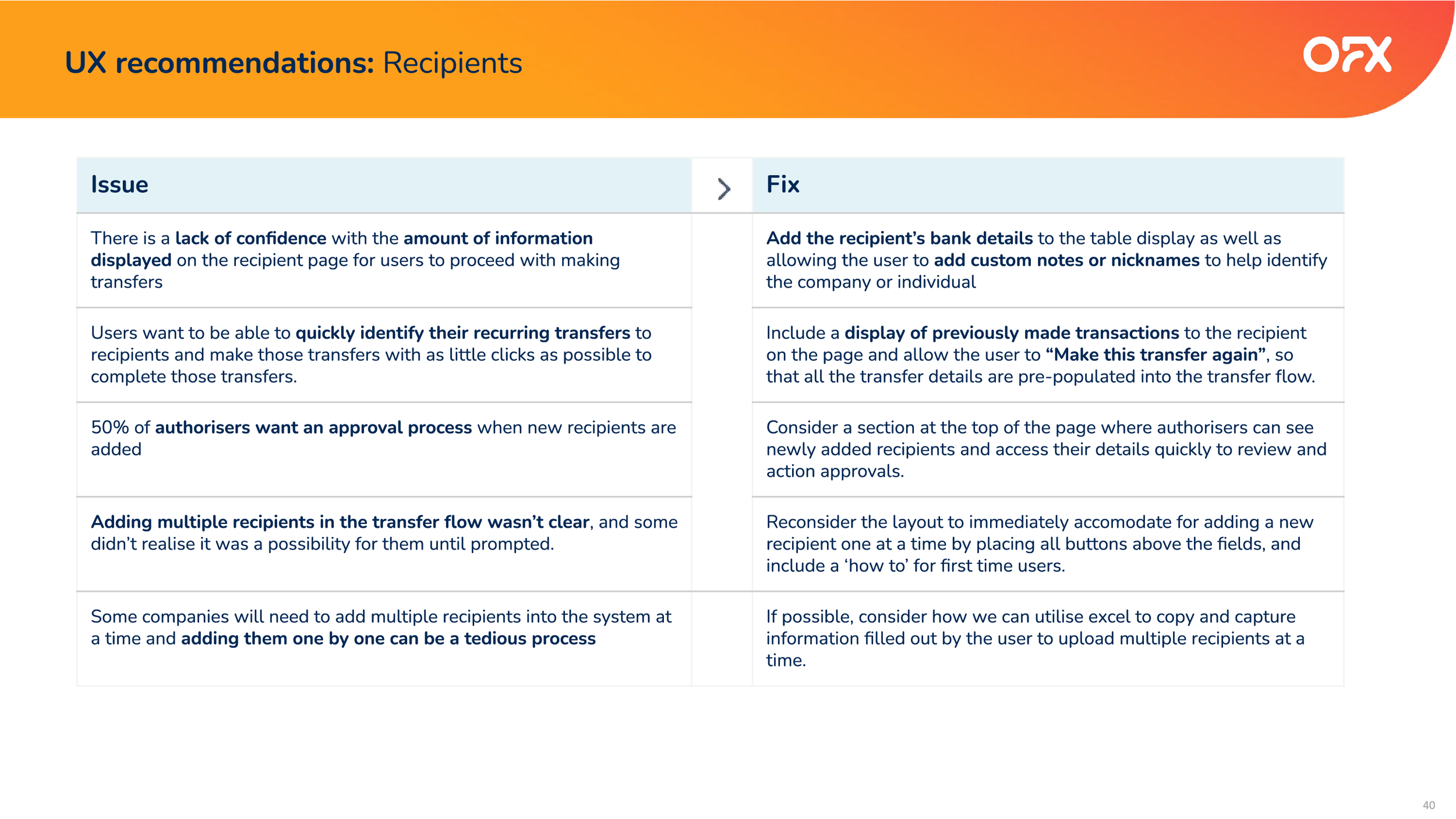
Multiple recipients
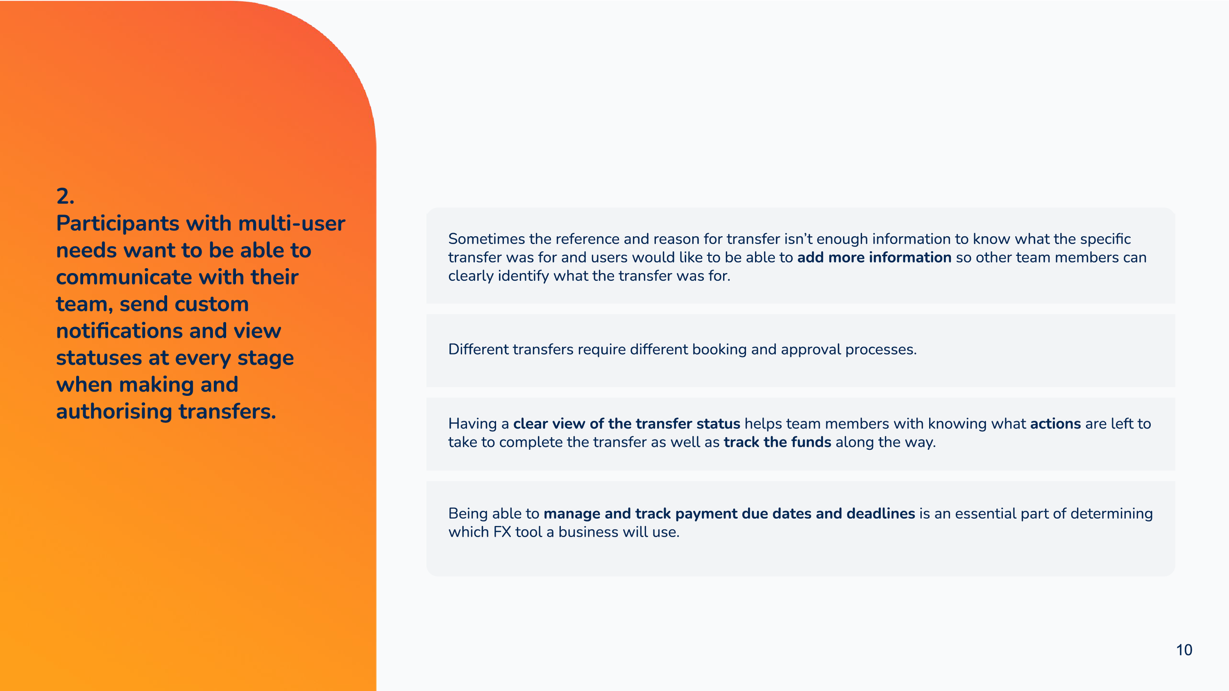
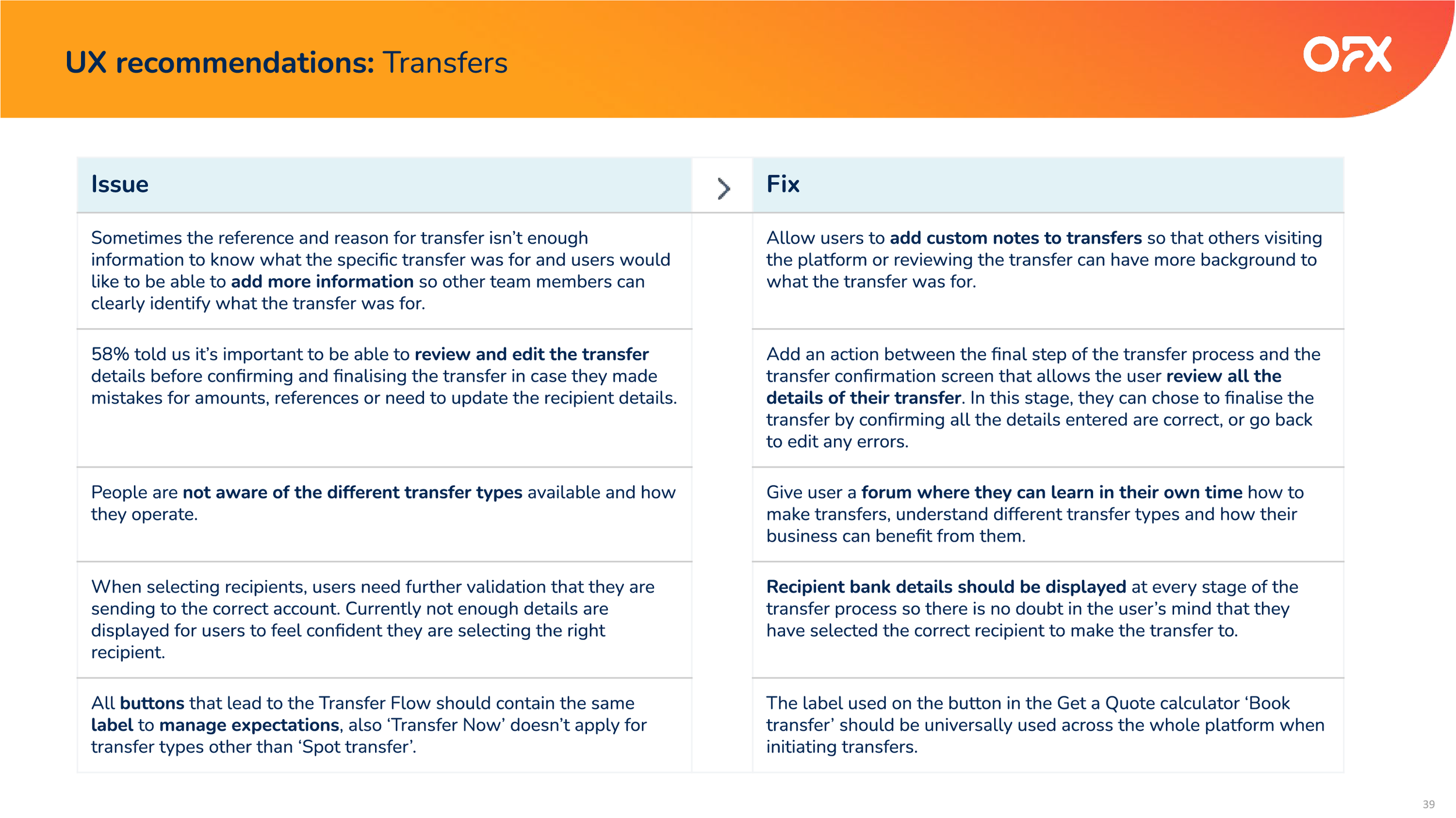
Users want the option to transfer money to multiple recipients at a time.Send notifications
Users want the ability to notify other parties about the transfer details.Transfer Types
Users want the convenience of knowing what transfer type will suit their needs.Duplicate transfers
Users are booking duplicate transfers to try and get the best rates.Recurring transfers
Users want the ability to set recurring transfers.What we want to achieve:
✅ Ensure the payments part of the transfer is done efficiently
✅ Simplify the transfer experience by reducing the amount of steps taken
✅ Make the transfer button easily accessible
✅ Simplify transfers for single users
✅ Simplify transfers in a multi-user setting (viewer, maker, checker)
✅ Give user control in customising notifications
✅ Give the user the option to cancel a transfer within a set time
✅ Instil trust and confidence
-
I did a large scale landscape research assessment of all the features that both indirect and direct competitors are using in their products to see where we we would need to meet the demand expected by our customers but also to see where we could innovate and do what hasn’t been commonly done.
The login experience exploration

2. Understanding archetypes
3. Account settings exploration


