While working at Student Super, I was asked if I could come up with a concept redesign of the homepage for the company’s other brand, Student VIP. Prior to this I had no engagement with the brand and pitched this idea after learning about the existing site.
THE PROCESS
The first thing I noticed about the site was the accessibility issues of putting orange text on grey backgrounds. For me as a designer, it’'s really important to be able to create a product that all types of user can easily interact with. My second observation was that site was very block heavy. I wanted to shift this by making it feel more organic and simple that flowed seamlessly.


UNDERSTANDING COLOUR
It was apparent that every topic was defined by a certain colour, so I explored the site to understand which colour represented each topics. This is an interesting approach I wanted to make sure I kept in the updated design, so that users who had an association with certain topics based on colours were able to identify them easily. The following were the colours provided to me:
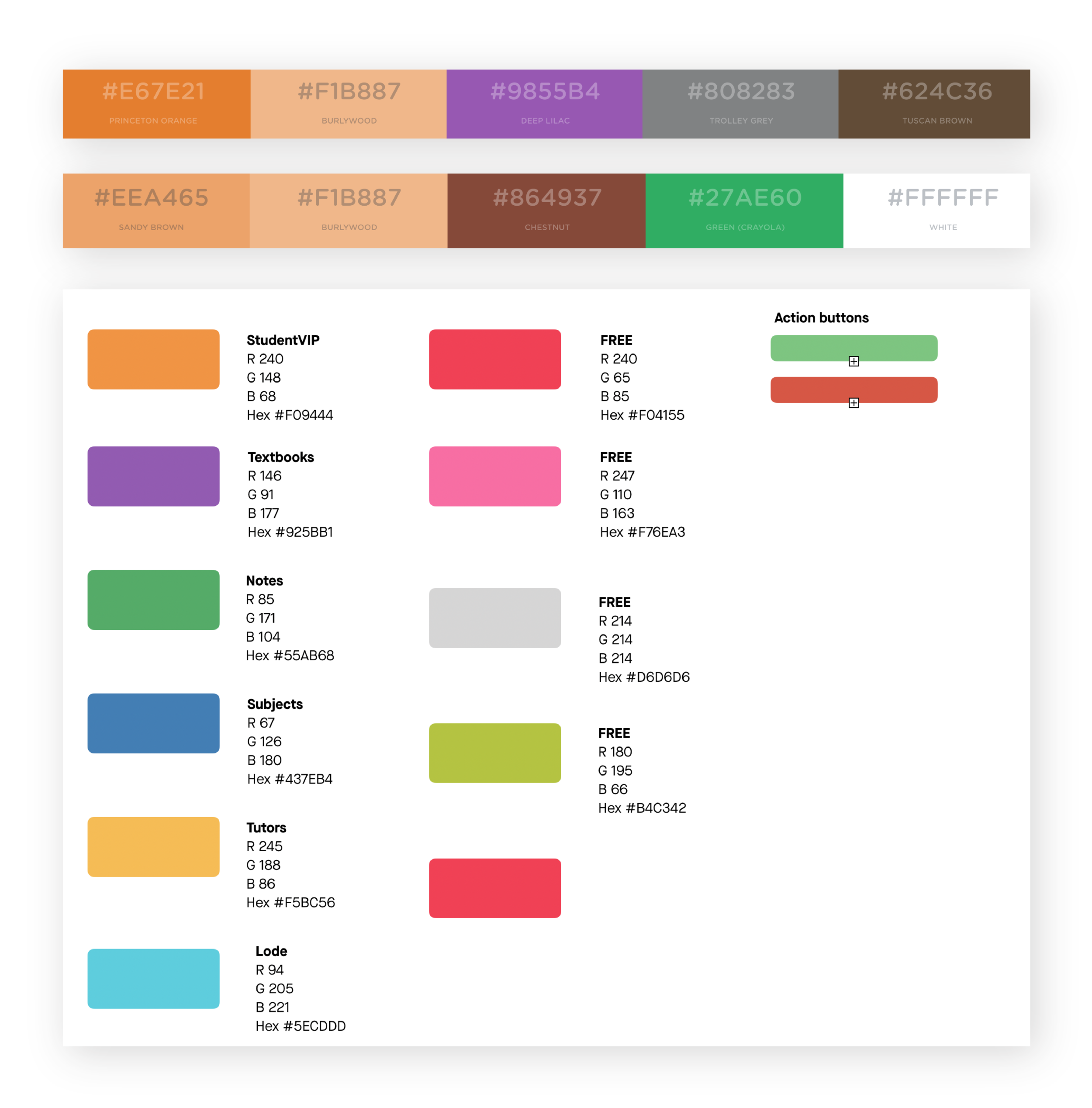
REDEFINING THE COLOUR PALETTE
I felt that there was a lot going on with the original colour palette, especially considering there were two types of formats handed to me to use. Testing out a range of different colour combinations, I simplified the colours so that they would work as a set.

USING THE STUDENTVIP MASCOT
The StudentVIP brand uses pandas as their mascot. I modified some versions of panda with objects and colours that link to certain topics to create a visual relationship between the topics other than just colour.

THE REDESIGNED HOMEPAGE
